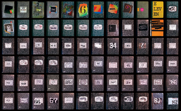
The great Michael Bierut’s collection of composition notebooks (1982-2008) has me feeling all self-righteous and vindicated for choosing their unfussy functionality over the trendy, overpriced moleskine.
Seeing his laid out in rows like that was so inspiring, it almost made me second-guess the practice of ripping out my rough drafts and destroying them as soon as I type the words in. Then I remembered what my rough drafts look and read like, and no, they really do belong with the cat litter.
Bierut writes both about his system and what it’s like to look back on the notebooks he’s been keeping for more than 25 years:
I use them in order. Tibor Kalman once asked me why I didn’t have a different notebook for every project. I have to admit, this would be more useful. But I don’t. I fill each one up and then move to the next one, the projects all jumbled together….
At the beginning I used to customize the covers. Those were the days when I used to handmake every birthday card. After a while it started to feel like an affectation. Nowadays I tend to just write the number on the front. The marbled cover, beloved by Ettore Sottsass during his Memphis period, may be iconic enough on its own.
Several years ago, when moving away from this site’s original paint-spatter background, I had my heart set on an homage to the composition notebook. For a long time, behind the scenes, Max tried out different marbled designs. But they were too distracting online, so we settled for the graph paper (now, as of 2010, the graph paper is gone too).